
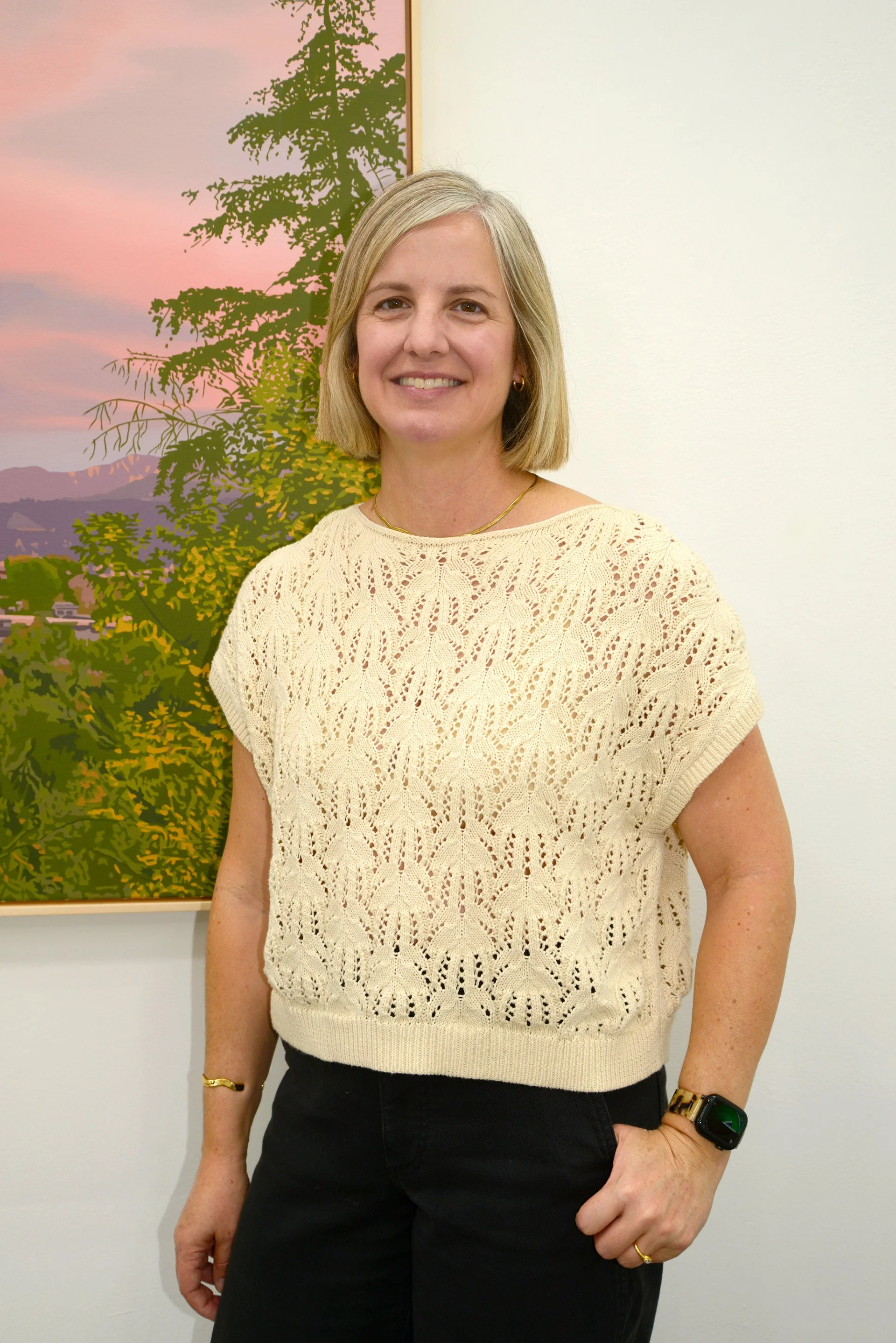
An Interview with Lindsey Warren for Keystone Art Space
Julie Green: I’m here with Lindsey Warren at Billis Williams Gallery in Culver City, where her new exhibition, Somewhere Here, is on view. Lindsey, tell me about the title. What inspired it?
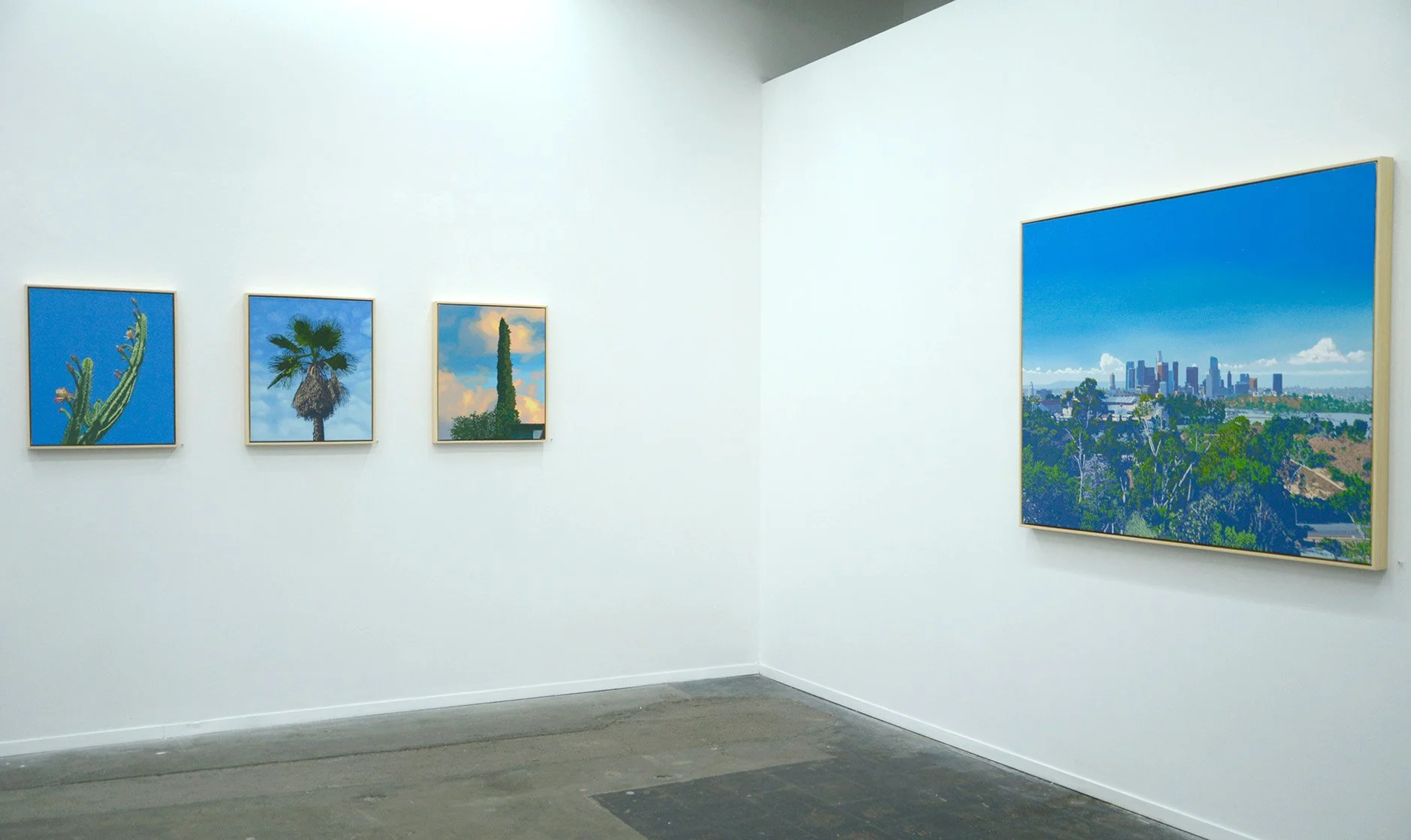
Lindsey Warren: I chose Somewhere Here because the imagery in my work feels both universal and specific. The paintings depict particular places, trees, and landscapes in great detail, but you don’t necessarily need to recognize the exact location to connect with them. You might know precisely where a palm tree stands, but that knowledge isn’t essential to experiencing the painting.
Julie Green: I love that. The work is regional, but that recognition depends partly on the viewer. As an Angeleno, I immediately associate the palm trees, cacti, and mountain ridges with Los Angeles. But someone else might see a town anywhere in the United States.
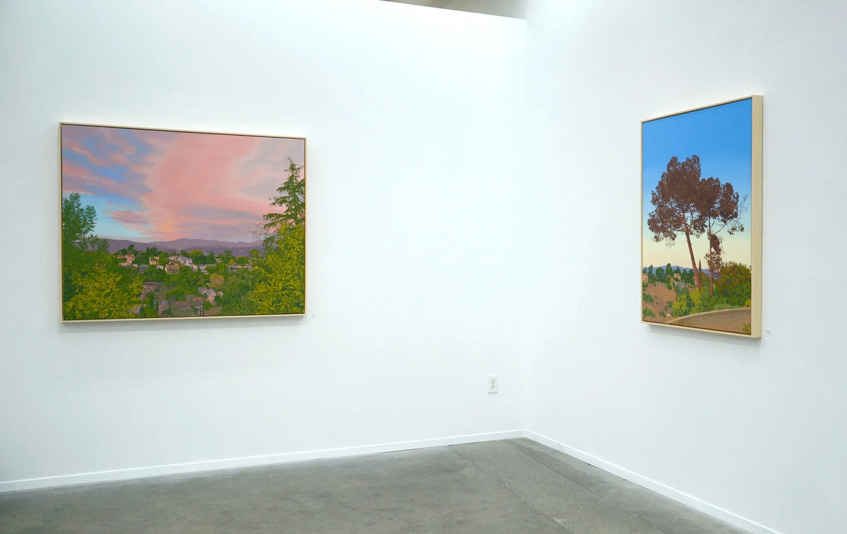
Lindsey Warren: Exactly. I also think the color helps locate the work. The skies here have distinctive colors created by atmospheric conditions and our particular geography. We experience extended periods of twilight because the mountains are so close to the ocean. The topography creates a beautiful interaction between the setting sun, the hills, and the surrounding landscape, producing those purple mountain ridges and unusual colors in the sky.
Julie Green: Most people associate the ocean with a relatively flat landscape, but our coastline is defined by ridges and mountains. The light reflects off those formations and illuminates the communities below. I hadn’t thought about that relationship in quite that way before.
People often attribute Los Angeles sunsets to smog. Is that really what creates those colors?
Lindsey Warren: Not necessarily. Air quality has improved considerably since the 1970s, and heavy smog can actually obscure the sunsets. When the sky is hazy or gray, those dramatic colors can disappear. In winter, when the air is clear, we can have especially beautiful sunsets because of the way the light reflects across the landscape.
Photographs, Memory, and Invention
Julie Green: Do you work primarily from photographs, memory, or a combination of the two? How does your process unfold?
Lindsey Warren: Those things work together. I use photographs, although I don’t necessarily take them specifically for painting. When I see something that interests me, I photograph it. That process has changed significantly since cell phone cameras became commonplace. Before that, I would go on walks specifically to look for things to photograph. Now, because I always have a camera in my pocket, I can capture something whenever it catches my attention.
Memory becomes especially important when I’m balancing the colors of the foreground and background. I often photograph landscapes at sunrise or sunset, when the light is softer and the shadows are muted rather than sharply defined. But it’s difficult for a camera to capture the colors you actually see at those times of day. The foreground might become a silhouette, or the camera might exaggerate the contrast between the sky and the landscape.
That’s when I have to work with multiple photographs, memory, and invention. I use those elements together to create the colors and relationships that I remember experiencing.
Julie Green: As a photographer, one of the things that immediately strikes me about your paintings is the way you handle contrast. There isn’t a sharp separation between the foreground and background, yet the multiple layers recede into the distance. That muted quality of light is particularly compelling.
You’ve mentioned that you used to go out with a camera specifically to find subjects. Has observational landscape painting always been part of your practice?
Lindsey Warren: I have a very traditional background in observational painting and drawing. I attended a school with a conservatory-style approach, where we learned drawing before moving on to color and design, and then painting and sculpture. It was a very foundational, structured way of learning.
Those skills eventually led me toward this kind of work, although I spent a long time rebelling against that training. I wanted to make the opposite of what I had been taught, so I experimented with different techniques, including very fast painting, thick abstraction, and paintings completed in a single session. I explored many approaches, but I always remained within the realm of painting.
Gradually, I found my way back to observational work.
I think the turning point came when I returned to the West Coast after living on the East Coast for about fifteen years. I came back to help family and was staying at my childhood home before beginning graduate school. Suddenly, I was looking at Los Angeles with fresh eyes. I remember thinking about how strange the city was: the light, the architecture, the geography. Everything felt different from Boston and New York, where I had been living.
Julie Green: Los Angeles has a geography that can be disorienting, even for people who live here. You might think you’re heading north, but you’re actually traveling northwest because of the angle of the coastline.
Lindsey Warren: Exactly. I was disoriented when I first returned because I knew where the ocean was supposed to be, but it was at an angle. You have to understand the orientation of the coastline to navigate the city.
While I was visiting, I started taking a lot of photographs because I was noticing things I hadn’t appreciated before. The architecture was particularly fascinating because of its variety. Boston has historic neighborhoods with brownstones and ornate buildings, whereas Los Angeles brings together buildings from the 1920s, Victorian structures, mid-century architecture, and modern glass-and-metal skyscrapers. They exist alongside one another in unexpected ways.
I was also noticing the relationship between the architecture, the light, and the natural environment. Los Angeles has all these unusual natural spaces that people don’t necessarily associate with the city. Neighborhoods change dramatically with the seasons, too. Some become green in winter and brown in summer, while others follow the opposite pattern.
I began incorporating those observations into inventive landscapes. They weren’t necessarily portraits or precise descriptions of particular places, but they drew on the things I was discovering about the city.
When I eventually moved back to Los Angeles, those ideas really opened up for me.
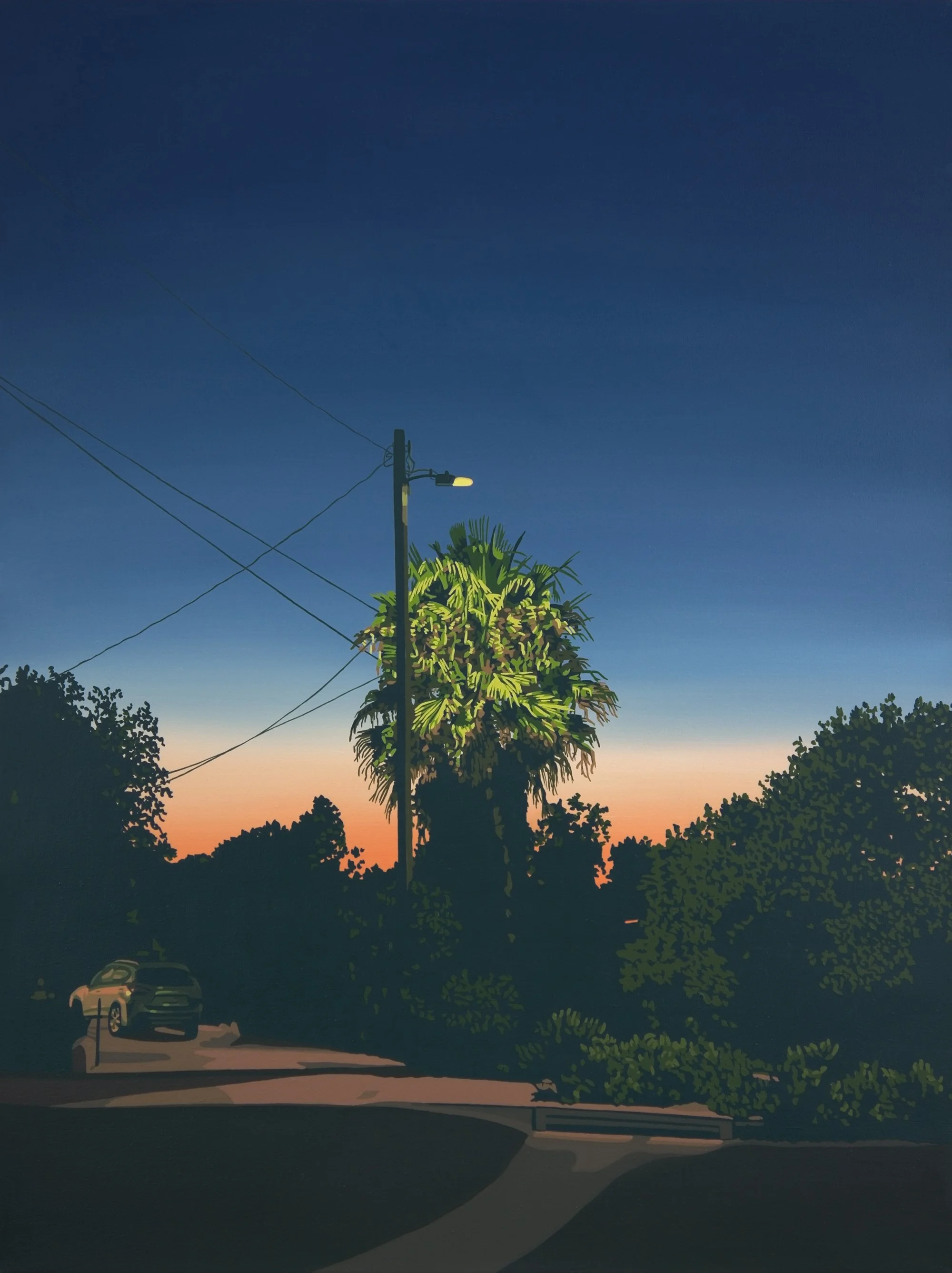
Lindsey Warren Night Light On Danforth Oil on Canvas 33” x 44” 2026
Portraits of Trees and the Architecture of Light
Julie Green: This is a substantial body of work, and you completed it over a relatively short period. You mentioned that you had been thinking about the exhibition for about a year and a half, with roughly a year devoted to making the paintings.
The exhibition includes expansive views of neighborhoods and landscapes alongside beautiful close-up studies. Can you talk about your thought process in bringing those different approaches together?
Lindsey Warren: My original concept for the exhibition had two parts. First, I wanted to make what I think of as tree portraits. Before this body of work, I had been painting wide vistas with a lot of detail. I wanted to focus more closely on individual plants and trees, exploring how they relate to the sky behind them.
The second idea came from photographs I had collected that featured interesting light sources.
For example, in one painting, the light falling on a palm tree comes from an artificial streetlamp, while the rest of the scene is illuminated by reflected sunset light. In another, a tree that would ordinarily appear green looks red because of the angle of the light, the time of day, and the way the warm sunset reflects off its surface.
I wanted to bring those two ideas together: the particular character of a plant or tree and the unexpected colors created by its relationship to light.
I also wanted to include a few larger, expansive landscapes to give viewers a broader sense of place. Those paintings connect the more intimate studies, making the exhibition feel cohesive. The work is not simply about anywhere; it is about somewhere specific, even when the location isn’t immediately recognizable.
The light is what ties everything together. It creates unexpected colors in the buildings, trees, and surrounding landscape.
Julie Green: One of the things I find particularly striking is the way the sky seems to expand over the town, coloring everything beneath it. In some paintings, the trees frame the scene as silhouettes, while the light seems to descend across the landscape.
There is a theatrical quality to the way you arrange these elements. Is that something you consciously consider?
Lindsey Warren: That’s a good way to describe it. I think about how I can present the most information with the fewest marks.
Sometimes I begin by adding too much detail because I can see so much more than what ultimately needs to be included. But I have to ask myself whether all that information is necessary. Often, it isn’t. I want to direct the viewer’s attention toward particular areas, sometimes emphasizing something unexpected and sometimes highlighting what I consider most important.
I think a lot about atmospheric perspective, both in terms of how it works visually and what it means. Traditionally, the foreground would be rendered with the sharpest detail, and that detail would gradually dissolve as the landscape recedes into the distance. I use that approach, but I don’t want it to dictate how every painting functions.
Sometimes I want the houses in the distance to have more detail than the leaves in the foreground. You can still understand that you’re looking at a tree and recognize the spatial relationships between the different elements, even if the distribution of detail doesn’t follow conventional expectations.
There is a constant process of adding and subtracting as I work. I’m deciding where detail is needed, where it can be reduced, and how those decisions affect the painting as a whole.
Julie Green: That balance is one of the strengths of the work. The paintings allow the eye to move through multiple layers of space without becoming overwhelmed by detail. Your color palette is also remarkably controlled. The subtle shifts and muted tones are extraordinary.
Lindsey Warren: Color is one of my specialties.
Creating Tension Through Color and Composition
Julie Green: It certainly shows. Let’s look at the cityscape depicting downtown Los Angeles, viewed from Elysian Park. You can see Dodger Stadium in the foreground and downtown beyond it.
What I find particularly compelling is the use of muted blue in the shadows. There is so much movement in the painting, especially in the trees and foliage, that it almost feels like a conversation is taking place. At the same time, the open sky provides a sense of calm. How do you create that tension between the active brushwork in the foreground and the more expansive space above it?
Lindsey Warren: One of the hardest decisions is determining how much activity to include in each area. There are visual principles about balance that we learn through painting and photography, but the process also involves deciding how much visual noise a painting can sustain.
If everything is equally busy, the painting can lose its focus. The different elements begin to compete with one another, and the composition can cancel itself out. I experiment with the placement of the horizon line and the distribution of detail until the painting feels balanced.
I also enjoy challenging some of the conventional rules of composition. We’re often told not to place things directly in the center, so sometimes I deliberately do the opposite. The tallest building or the horizon might sit almost in the middle of the composition, but I counterbalance that placement with other elements.
Julie Green: I appreciate that willingness to push against those rules. As a photographer, I’m always checking the horizon, and I immediately noticed how close yours comes to dividing the painting in half. Yet it doesn’t feel static because the mountain ranges and clouds interrupt that horizontal line.
The different elements create tension without making the composition feel unbalanced. Even though the subject matter might initially seem quiet or familiar, there’s a great deal happening across the landscape.
Lindsey Warren: That’s exactly what I hope to achieve. I want the painting to become more interesting than a photograph of the same subject.
Sometimes I’m excited by a painting because of the way I’m assembling the composition, even when the original photograph doesn’t seem particularly compelling. I might look at the reference and wonder whether the image is interesting enough to paint. But the possibilities emerge when I begin thinking about how I can transform it.
The painting becomes a process of puzzling the elements together: adjusting the perspective, reconsidering the relationships between the forms, and deciding how the colors will interact. The original photograph is only the starting point.
Julie Green: I think you’ve succeeded beautifully. The painting has a wonderful relationship between its different levels of space, and the color creates a sense of movement throughout the composition.
You also seem to distribute colors very deliberately. Rather than allowing a particular color to remain isolated in one area, you repeat it across the painting, creating connections between otherwise separate elements.
Lindsey Warren: Yes, I think a lot about how color moves through a painting. I try to distribute colors throughout the composition, and I often approach the process as a game: How few colors can I use to complete the painting?
Limiting the palette helps create cohesion. Whenever I mix a color, I try to use it in many different places, sometimes thirty separate locations throughout the painting.
Julie Green: That repetition creates a visual conversation. The shadows of the buildings begin to relate to the shadows in the foreground, and colors that initially appear separate become connected. The painting develops a kind of internal logic.
Lindsey Warren: Exactly. The colors need to relate to one another. Repeating them throughout the composition allows the different elements to feel as though they belong to the same world.
Julie Green: That’s especially effective in the way you handle the relationship between the foreground and background. The colors are muted, but the painting still has remarkable depth. There is a subtle tension between the different planes of the landscape, and the composition feels carefully orchestrated without appearing overly controlled.
Your paintings remind us that a landscape is not simply a collection of objects in space. It is also a set of relationships between light, color, form, and perception.
Lindsey Warren: That’s a lovely way to put it. Those relationships are what keep me interested in painting. I’m always trying to find a way to make the image work as a painting rather than simply reproducing what I see.
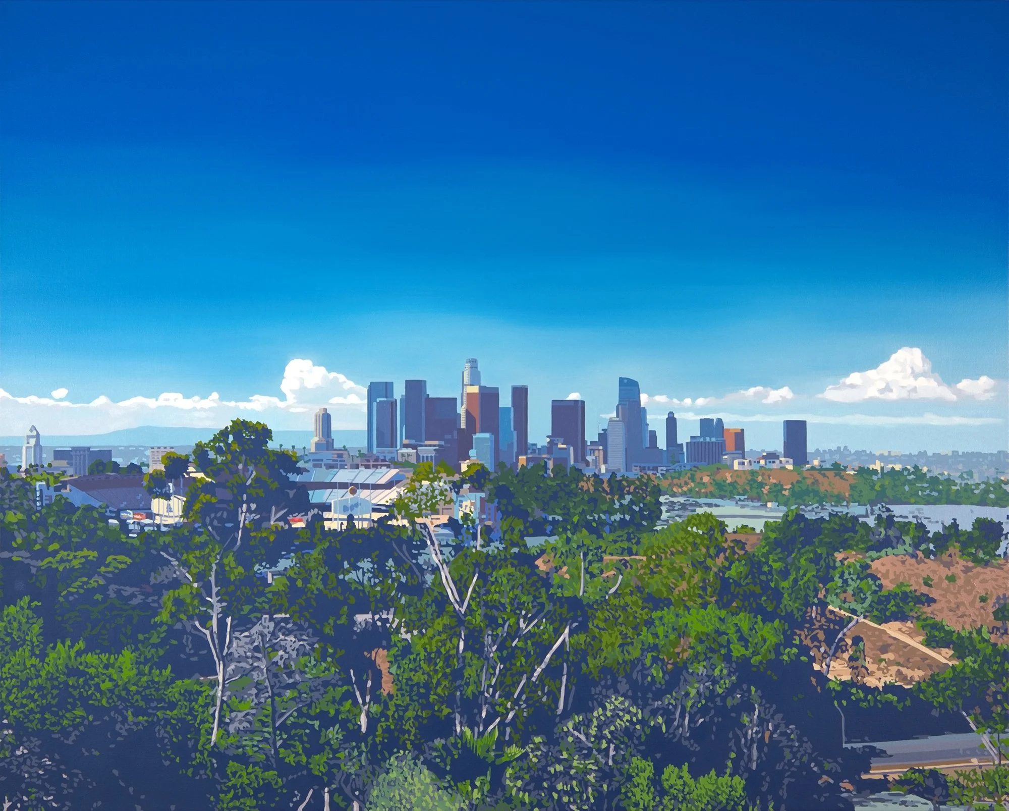
Lindsey Warren Stadium View Oil on Canvas 44” x 55” 2026
Building a Practice at Keystone Art Space
Julie Green: Since this interview is for Keystone Art Space, I’d also love to hear about your experience there. How long have you been a member?
Lindsey Warren: I’ve been in our current building since it opened in 2016. I chose my space when the walls hadn’t even been built yet. The locations were marked on the floor with tape and spray-painted dots, so I was able to see the space before anything was constructed.
Before that, I spent a few months in Keystone’s previous building. But I’ve been in the same studio in the current building ever since.
Julie Green: That’s wonderful. You’ve been there from the very beginning of the current space.
What do you value most about being part of Keystone?
Lindsey Warren: One of the reasons I love Keystone is that it is run so professionally. Everything is well maintained, the space is clean, and events and gallery activities are handled thoughtfully. The organization attracts a wonderful group of professional artists, both because of how it operates and because of the care taken in selecting its members.
The studio itself also works particularly well for my practice. I chose it because I can control the light when I need to. Sometimes I want completely controlled lighting so I can photograph a work or examine what I’m doing. Other times, I prefer natural light, and I can take advantage of the daylight coming through the windows and the open studio door.
Having both options is important to me. I need to be able to control the conditions when necessary, but I also appreciate working with natural light.
Julie Green: It sounds like you’ve created a studio that supports the different aspects of your practice, from making the paintings to photographing and documenting them.
Lindsey Warren: Yes, although after ten years in one space, organization is still a constant battle!
Julie Green: I think every artist can relate to that. A studio is always evolving alongside the work.
Thank you, Lindsey, for sharing your process and for giving us such a thoughtful look into Somewhere Here. It’s been wonderful to hear how your observations of Los Angeles, your understanding of light, and your approach to color come together in this exhibition.
Lindsey Warren: Thank you. It’s been a pleasure.
Julie Green is an artist and interviewer working with Keystone Art Space to share conversations with artists about their work, creative processes, and evolving practices.
Lindsey Warren’s exhibition, Somewhere, Here is on view October 17 - November 14, 2026 at Billis/Williams Gallery - 2716 S. La Cienega Blvd. Los Angeles, CA 90034
lindseywarren.com